Pancake Pantry Iconography
About the Company
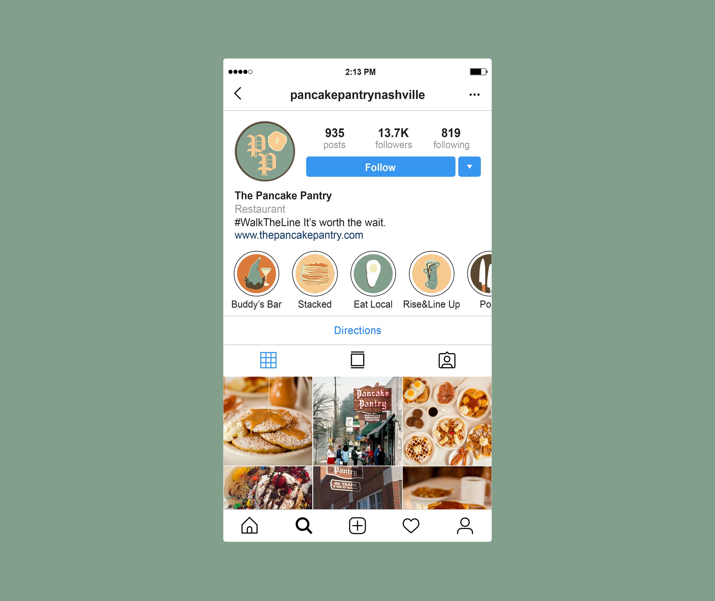
The Pancake Pantry is a local Nashville hot spot. Their branding, however, is not as consistent as their pancake quality. The local has a very unique typography that gives me the impression of German or Swedish lodging. The icons they use do not have the same aesthetic. They seem to be very generic, which does not add anything to the brand of the company.
Made in Procreate.
Project Outline
For this project, I wanted to create a set of branded iconography that Pancake Pantry can use throughout its Instagram or website to strengthen its branding and stance as a company. The icons created go along with the branding guidelines already set by the business.
For reference, the first two photos are screenshots of their current Instagram (as of 1/8/25).