Jamie’s Eats & Sweets Rebranding
About the Company
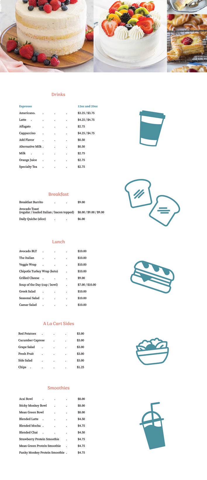
Jamie has always had a passion for making tasty treats and savory food for friends and family. A dream of hers was to create a cafe that gave her community to experience what so many others have praised: Jamie’s Eats & Sweets. At Jamie’s, we offer a variety of bakery items. From wraps, salads, specialty teas, espressos, and refreshing drinks to sweeter items like cakes, pies, cookies, muffins, bread loaves, and pastries, there is something special for everyone.
Made with Adobe Illustrator, Photoshop, and XD.
Project Outline
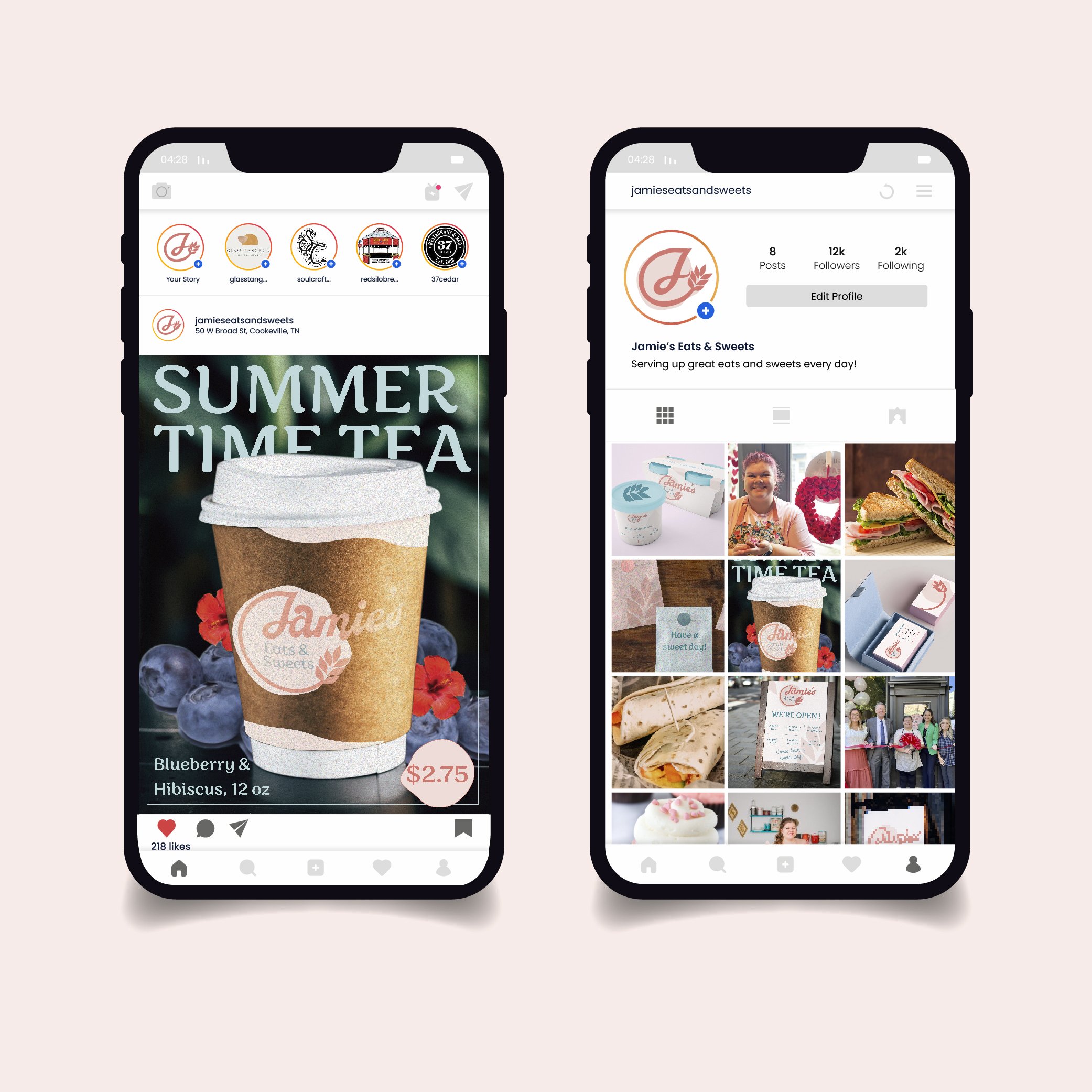
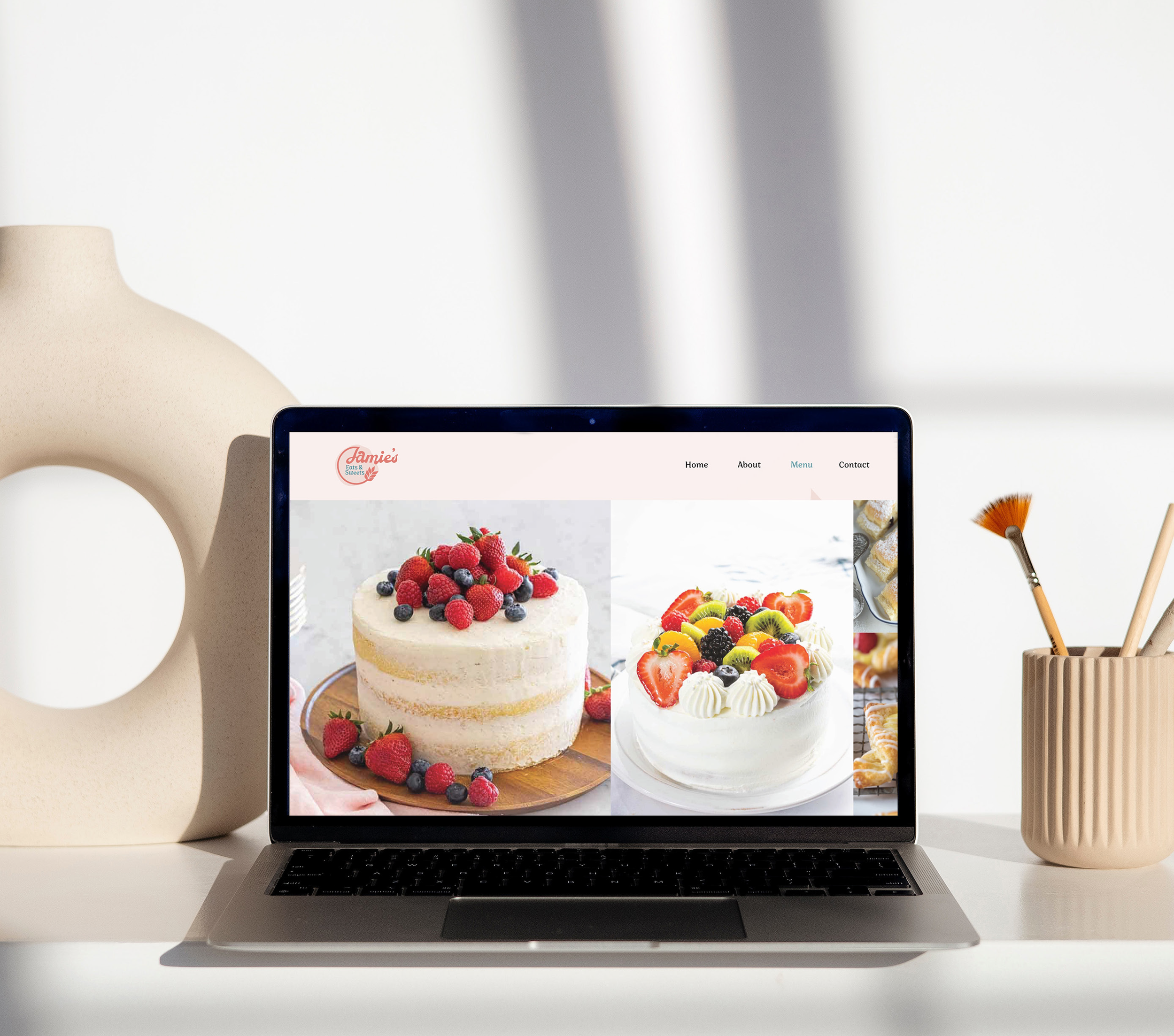
This project’s objective was to rebrand a local business that we believed needed a refresh. Jamie’s Eats & Sweets logo did not seem to create an interesting visual for the business’s food. The environment of the restaurant is cozy and welcoming and the original logo did not seem to match. To go along with the fresh rebrand I created a new website for Jamie’s Eats & Sweets. I wanted the website to give off a fun, youthful, but organized visual look.
The Process
The color scheme was inspired by the blue and pink used in gender reveals since babies give off that sweet and playful vibe I am going for. Since Jamie’s is such a well-rounded restaurant, I did not want to limit the visual to just a pastry or baker icon. Instead, I chose a wheat leaf to be incorporated into the logo and visuals of the website. To do this, I made the bar of the “J” ease into wheat, an ingredient in almost all of her menu food items. This curve gave a space to fill in with “Eats & Sweets” to balance the logo. I filled the back of this space with an organic, almost circle-like shape. This resembled dough after being rolled out. All of these elements together create a balanced and visually interactive logo design. The images used are high-quality photos to showcase the detail put into the food products. The icons used throughout are all outlines. This allows them to not seem so heavy compared to the light background and thin fonts used.